Thank you very much for the tips! You're right, I do need to work on my shading. I think adding yellow will help a lot.
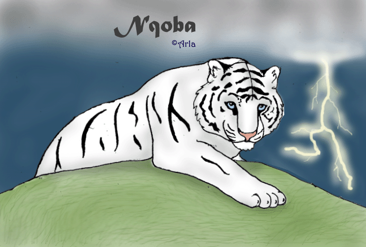
About the sky, yes, I realize that clouds don't normally form in a "row" with the rest of the sky behind them blue. I did this for artistic effect in this particular picture. I wanted to make it look like the tiger was creating the storm only in his presence. I could have made this more prevelent, however.
Thanks again for the tips! I will definitely try them out next time ^_^


It's a nice picture, but I here are a few tips to make it look better;
The sky is too bright. The lightning looks good, but it would've been better if your sky was dark. Clouds also don't just take up one 'row' in the front. A cloudy sky with lightning usually reaches everywhere you can see. So dark clouds and more white-ish lightning would've been best.
The grass is a few shades too light-green. Remember that everything is build up from a lot of different colours. There are different shades of green, so try to use more to give the grass some depth.
The tiger looks very good, but again, deepen the shading. And instead of only using grey, try to add a hint of yellow in it. (Just think of Ice Bears. Ever seen a 100% white Snow Bear? They all look a bit yellowish. =) )
So, to cut a long story short; Use deeper/darker shading. Your picture will not only look better, it will have a lot more depth in it. ^_^