
Thank-you! I adore the Meridian series! :)

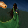
Lariset - PE Round 15 by @klawzie (Chella Reaves)
Lariset - a pretty winged human type. For PE Round 15. :)
I took so long to finish it, I wanted to do something interesting with it, so I played with tones in OpenCanvas - and I like it!
Comments & Critiques (6)
Preferred comment/critique type for this content: Any Kind
Posted: Thursday, 25 March, 2004 @ 05:12 PM
The tonework really gives the picture alot of flair. I love the background and the tones on her pants... Great inking as well! She's really pretty. Some brighter highlights in her hair might add a little more punch, but I'm the kind of person that likes that kind of thing :9
Posted: Thursday, 25 March, 2004 @ 11:09 PM
I really love the palette you used for this image. The softer colors, coupled with the tones, make this picture have a very unique feel to it. I am definetly impressed with the different tones you used, and the way you've layered them over the already quite decent coloring. The diagonal composition is very unique, as well!
Awesome character design--I really like your style. The anatomy and expression are captured very well, and I love her wings. Her clothing design is very cool as well--the belt buckle is an excellent touch! And I wish I had gloves and boots like those!
The red in the cards seems slightly out of place--it draws the eye almost directly to them, since that color is so much brighter than any color in that image. Is that intentional? It's a little disconcerting, is all. Other than that, great image. :)
Posted: Thursday, 29 September, 2005 @ 02:42 AM
(Belated, yet...)
Thank you very much for the comments! :) As for the red on the cards... It was either in the character description (I can't remember off-hand) or I was trying to go for something that wasn't blue, gold, brown or white...
(The bad thing about being lazy and not responding when you get the comment is you forget most of what you were thinking while you were working...)
Your style here really reminds me of the Meridian series, especially the body. I love the color job, her hair is beautiful!