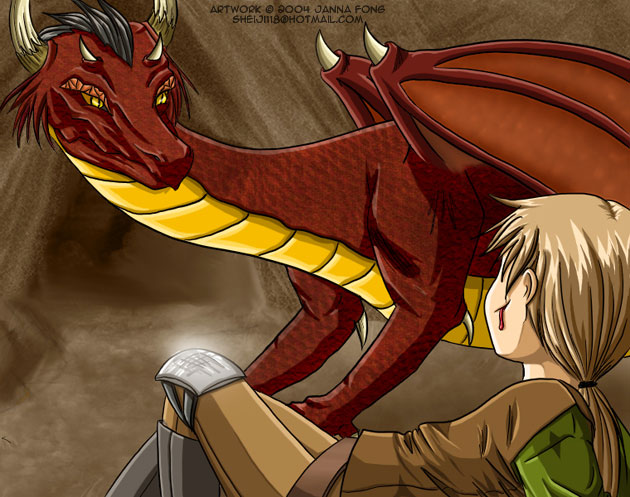
Wow, This is absolutely beautiful. I really like the dragon, the boney eyebrows, and the look of the horns are great. I also like the drop of blood on the guy laying there. Also i think that the scratches on the knee pad are an excellent additive to the picture. I still think that the wings are a little too small, but they are done very nicely as well. As for what crono said about the bulge in the neck, i disagree. I happen to own a snake, and the bulge in the neck is very logical, considering that the neck would expand to let the food pass through. Great job, i look forward to ur next project
Sincerely, Ikaika


You really did a good job at leaving it up to the imagination here. Was that the intention? If it were up to me, the human, (looks like it could be either gender, really), would be just after fighting something or someone and then resting (or having fallen over) then seeing the dragon approach. Followed by that the warrior would either be eaten or converse with the dragon... 'lest understand it in some way. (that it isn't hostile, that is.) I like the outfit on the human, nice mix of texture and baggyness. Your biology for the human is good. I like the hair, too. That's good overall. On to the dragon. The face has good basics, it looks intense and calculating. (and a little devilish, I might add.) The way you shaded the skin, it looks like its an old dragon; the skin seems to hang off and doesn't look like it's tight against the dragon's body. The lineart is good except that I find the dragon's neck to be a little hard to believe - it's got too much of a buldge in it. Other than that it's good work. I don't complain about backgrounds - to me, they're just extra work that I usually don't even bother with. The BG that you did allows people to know that we're in a cave, or natural, indoor formation of somesort, anyway, and that's usually all the BG is needed for - to tell the view where a scene is taking place/ where a character is, etc. The only time when I'd deem it completely necessary, is for still-life drawings, as they've got no char to focus on - they're all atomosphere. Sorry for being so lengthy. Good work.