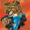
the bird needs to be replaced with a dragon,shooting flames of death, pain, and destruction

an art project... by @kathirvi (Katherine Irvine)
This is a copy of it right before the finishing touches. Not too bad, but something just doesn't seem to be working out right. I already got the grade (an A!), but I can't help but feel it needs something else. Any suggestions? Adobe 6
Comments & Critiques (3)
Preferred comment/critique type for this content: Any Kind
Posted: Wednesday, 03 April, 2002 @ 11:22 PM
i agree with Zane, a horrific dragon chasing away the hapless travelers and razing and incinerating the sleeping underwater city...(which would be rather hard to do..)
or you could just put something dark hued in the upper regions to make it balanced in contrast...that would really really help!!
at any rate i love it and i wanna know where you get your stock photos!!!
This did turn out cool. But I think you're right, there is something missing.
I think one thing might be...that...all your interesting stuff is along the edges of the pic (like a border), and the clock thing reads as the background, and not as a center of interest. In fact, those dark bushes right underneath it seem to catch the eye first (but it's hard to tell when you have to scroll to see the whole image).
OK. Here's something interesting. Try cropping the top of the thing off -- near the very tippy top of the page, the macaw's feathers are red...then they turn blue? Crop it so you don't have any of that red part above the blue. That might shift the focus some and make it less borderiffic.
Maybe do a light fade at the very bottom of the picture?
(just for the heck of it. Take some yellow lines and form a border about a half-inch away from the edge of the picture. Just to see what it does.)
Save a separate copy, then just keep playing with it digitally -- that's the beauty of the undo button! :D
Hope this helps! Do show me if you do anything to this!
my art: www.side7.com/art/daniwill