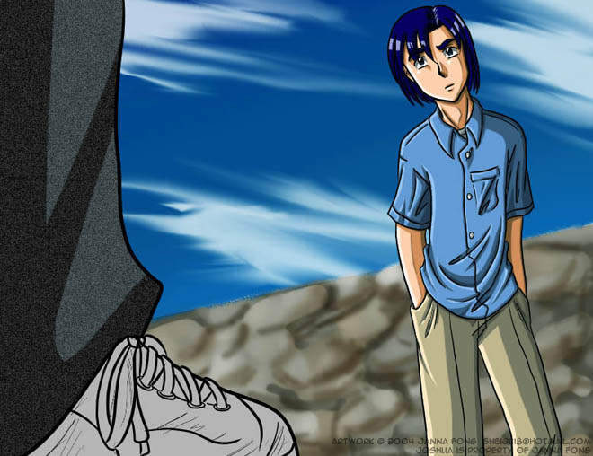
Joshua looks bored--or like he's trying to pretend to be bored. I like his slouch, and it makes me wonder who on earth is standing in front of him like that--the composition suggests they are trying to intimidate him. I think you've got a great composition, and the proportions on the characters are very well done--the only thing that really bothers me is that there is no shading on the sneaker. It's a very well drawn sneaker, but there's nothing to it, compared to the rest of the shading on this image. It looks so flat, compared to how well Joshua looks.
Also, I suggest again changing the color of light that you use. White is pretty good for indoor scenes, but for outdoors, sunlight usually has a little bit of an orangey or yellow tone. Just adding a faint transparent layer of one of those colors over the highlights can really change an image, to give it a lot more atmosphere. I think you're definetly advanced enough to try a technique like that. You're awesome. ^.^
Keep up the great work, okay? I do look forward to seeing it, even if lately it's taken me forever to go around commenting!


Frankly, i don't really see the errors that you are speaking of. All the proportions are correct, the pose is really great, one of the better slouching poses i've seen, and your coloring is really good once again. As i've said b4, the jeans, the black ones this time, look like a pair that i've got, lol. I think the scuffs on the shoe is a really nice touch. Only thing that i would say, is that the wall could use a little bit more detail, and be a little less blurry. really good job, even if it doesn't match the character...... besides, everybody has to get bored and frustrated some time right? XP
Sincerely, Ikaika