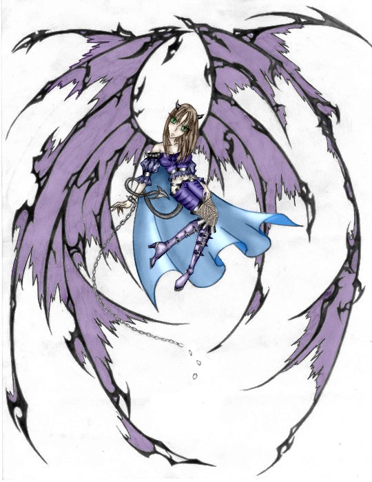
LOl, you hit the nail on the head, XD, the wings and the lack of background was the main part that I didn't finish ^^, I'll have to work on that a little later, the wings look pretty flat because they are, there's no shadows on them yet, there are a few other things that I want to fix, and quite a few other things that I haven't gotten to, but the wings are the most obvious. XD, and as you can tell if you've seen the original version of this, I got rid of the drainplug, XD. I really liked how the face turned out on this, but the shrinkage killed the detail on that, and I might have to work on the hair if it looks incomplete, it was not cooperting with me when I was doing this. I'm glad you like it thogh, I really appreciate it ^^

Me as a demoness colored by @Cyanide (Ana Nyte)
Colored this on the computer, me 2nd work ever colored completely this way, still learning and still not finished this...I kinda suck, but I have a sucky photo editing program...no patience, and shaking hands -_-
Comments & Critiques (4)
Preferred comment/critique type for this content: Any Kind
I absolutely love the wings on this image--they are amazing. You did a good job coloring, really--I think the only thing that would have improved it would be to clean up the image first--increase the contrast to get rid of the gray smudgey areas in the white parts, make the lines a little darker and clearer. Cleaning images usually takes a while unless you have clean lineart--even if I'm coloring an image on the computer, I still trace it with my light table onto a clean sheet of paper and make sure my scanner bed is very clean before I scan.
Hmm, if you don't have a program with layers, I don't think you can do this, but in Adobe Photoshop, they have a fun tool called the "magic wand." If you select part of the lineart that is black with it, you can use 'select similiar' and move the entire lineart (not the gray or other specks in the background) to a new layer, which is a fast and easy way to clean up the image. However, I don't know what program you're using--though I have to sa you've done an excellent job with the pretty highlights and whatnot.
You've chosen really good colors, and I look forward to seeing your next colored piece. You have an awesome design and I love the expression--very demonesque!
Thank you so very much! I really appreciate the advice, yeah, I probably should clean up images before I color them, and I would have with this one, but if you've seen the original version of this, which is in my gallery, it's kind of shaded with pencil, it wasn't originally created to be colored on the computer, I was just looking through my pictures and I thought, hey, maybe I can color this, because I like this and not enough people look at it, so I did, it's harder to color when you are going over pencil shading, it would have taken me three lives to clean it up, lol. But whenever I draw something else, I will be sure to follow your advice on both cleaning up and increasing the contrast ^^ and the program I used for this was a very cheep basic photo editing program TT, I can't afford photoshop so all of this was done on one layer...I wish I had photoshop, my life would have been easier then XD


Far from it to say that this is a bad coloring job. The only oddity about this picture, and I wouldn't call it a flaw, is that the wings look a little out of place with the style of coloring on the girl, but they're still wonderfully drawn and it's not that noticeable. The shading on her is very nice, particularly on the pants, boots, and cape. I imagine we're losing a lot of detail at this size, but it looks like you put a lot of effort into shading her and it looks good. A little more dynamic shading on her hair and some shadows on the wings, perhaps a simple background, and I'd call it complete. Nice work so far, though. I look forward to seeing this more complete.