thanks for your comment. it's true she doesn't show her figure, I got a bit carried away. I'll keep it in mind if I draw her again!

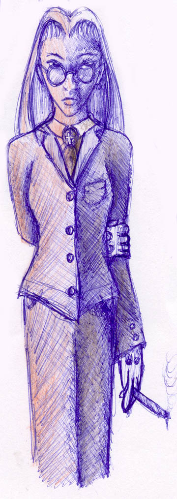
integra by @salendola (Edmee Sierts)
well, there really isn't much to say. my first ever Hellsing fanart. Integra reminds me of me. we have the same hairdo. grin I am so wicked!
Comments & Critiques (5)
Preferred comment/critique type for this content: Any Kind
Posted: Friday, 09 April, 2004 @ 05:59 PM
Nice. I like the scratchy style. Abstract..or...something..XP. Anyway, I should point out that not all of Integra's hair is pointy, just some of it in the front, and her scarf isn't tucked in. And in response to the comment above me, Integra showing her figure is a very worth excuse for deviating from the canon =3 (<--Integra fanboy) Great pic though ^^


Mm. Hellsing is a very yummi anime/manga. Alucard is oh-so-fiiine XD
Anyways, on to your picture. Looks pretty good except for Integra's hair normally covers the side of her face slightly and her suit doesn't flow to the curves of her body [because she doesn't show her figure. She's taking on the role of a man therfore her wardrobe is male clothing so it won't grip to the figure as much as it did in your picture. It'll just fall flatly like those school girl blazers or mens suits do]. Other than that everything is great. Keep up the good work.