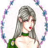
@serebronaga
Whitney

oh no not i
oh no not i by @serebronaga (Whitney)

It certainly turned out differently than I had envisioned when I sketched it, but I like it either way. Especially her mask :3

The green turned out a little too bright, and it's a little too....pink, but it's close enough for not having all the colours I needed ^_^

Durcombe (C) Me.

Category:
Rating:
Everyone
Class:
Finished Work
Submitted:
17y97d ago
Tags:
None
Other Work By @serebronaga

Comments & Critiques (3)

Preferred comment/critique type for this content: Any Kind

Posted: Tuesday, 06 February, 2007 @ 12:30 PM

I -love- the face and mask! The whole figure looks great, and I really like the pose you've used. The eyes are a bit weird (ie one being so much darker than the other) but it still looks good. The texture of the background looks a little messy, and could really do with a bit of smoothing out, but overall the picture looks really good. Great job!

Posted: Tuesday, 06 February, 2007 @ 12:41 PM

Her eyes are different :3 the eye on the mask looks normal, but her "eye" is completely black. That's why they look odd ^_~

My backgrounds always appear to be "rough", I'm afraid. I use them to provide colour, but I can't smooth them out because that will make the colour too dark and will overwhelm the figure D: I have yet to perfect the method!

Anyways, I'm quite thankful for your comment and I'm glad you like it!

Posted: Tuesday, 06 February, 2007 @ 12:51 PM

Have you tried using several very light layers to build up to the colour you want? It seems to me that would work, but then I'm not very familiar with the medium, so maybe not.

I thought perhaps the eyes were intentionally that way, but I felt there was no harm in mentioning it anyway, in case it wasn't and you hadn't noticed ^-^

Leave a Comment

You must be logged in and have an Active account to leave a comment.
Please, login or sign up for an account.

What kind of comments is serebronaga seeking for this piece?

  • Any Kind - Self-explanatory.
  • Casual Comments - Comments of a more social nature.
  • Light Critique - Comments containing constructive suggestions about this work.
  • Heavy Critique - A serious analysis of this work, with emphasis on identifying potential problem areas, good use of technique and skill, and suggestions for potentially improving the work.
Please keep in mind, critiques may highlight both positive and negative aspects of this work, but the main goal is to constructively help the artist to improve in their skills and execution. Be kind, considerate, and polite.