Good ideas! I would go back and fix it, but I saved it wrong. ^_^; Ah well, I'll store the knowlege for future drawings.

Sakura by @WillowWhiskers (Carmen Aistrup)
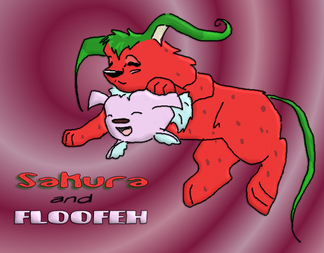
It's so ugly. Don't look at it! Well, actualy, if you can tell me why it's so hideous I'll allow you to look at it. Lol, It's my friend Nicole's neopet that I did for a trade to her. And her floud. I think the concept is so cute, so why it the picture so darned ugly?!
Category:
Rating:
Everyone
Class:
Finished Work
Submitted:
20y115d ago
Tags:
None


I think it's cute. The only flaw I can really see is the way her arm join right up to the top of her back with those outlines. The black lines should stop shortly after reaching the chest, just to give an illusion of a shoulder. Also, I think if the background were cream or green coloured instead of raspberry, it might clash less and create a more subtle palette. But overall it is quite good, I really like it.