Modern Inuyasha by @kristensk (Kristen Sharpe)
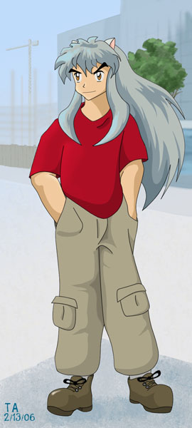
Just my version of how Inuyasha would look in modern clothes. I wasn't terribly happy with the earlier version of this image, so this is a revised one. I added some details to Inuyasha himself and took a stab at a real background. Thanks to Sage for suggesting a city scene.
Category:
Rating:
Everyone
Class:
Finished Work
Submitted:
18y282d ago
Tags:
None


Inu-Yasha! (Heart!)
Aww, he looks so cute. And I can actually see him wearing this outfit if he were to wear modern clothes. It echoes his regular costume with the slightly puffy/flowy pants and red shirt. So I don't think it'd throw him off any when he moved. :D
The background works really well here. I'm glad you made the effort to do so because (imho) it paid off. :3 It sort of looks like an animation still. ;D
As for critique - I think he needs a tiny bit more of a right (viewer's left) shoulder, and maybe some wrinkles in his shirt.
My favorite part (other than his expression) is how you did his hair. It's really nicely done. :3