Hellaro by @Eoweniel (Elgolas Kirmwood)
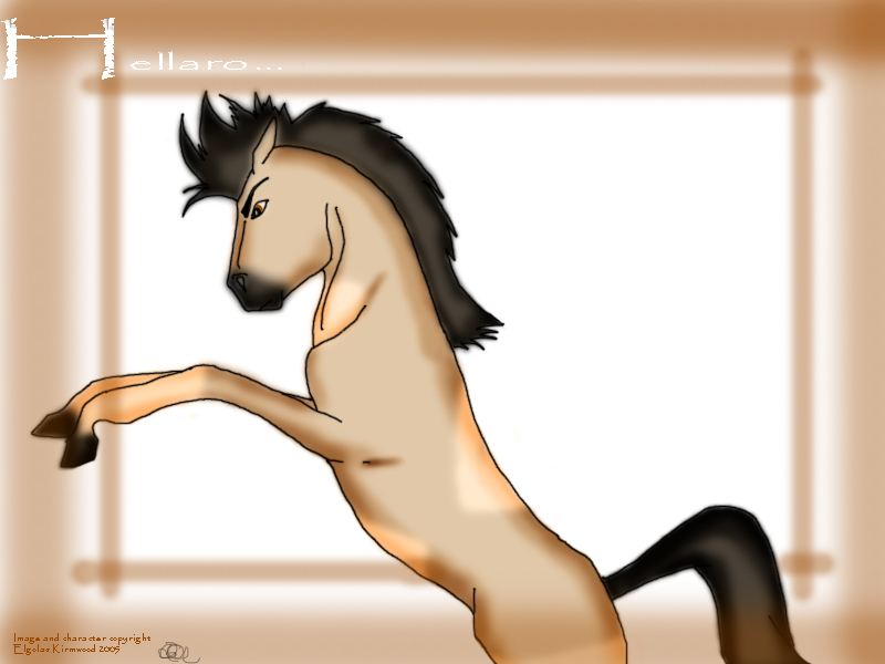
Just a doodle, scanned it in and coloured it. But... something looks funny, and I can't point it out. I dunno. Maybe someone can help me out?
Tried toning, but it looks yukky. Eugh!
Category:
Rating:
Everyone
Class:
Finished Work
Submitted:
19y152d ago
Tags:
None


I'll start by saying that you have a very good start, but, the horse does have a few problems in anatomy. They can easily be fixed by balancing a few things out.
The chest should be deeper. The length of the head should match the length of the neck, and the length of the neck should match the depth of the barrel.
The rump looks a little scrawny as well, in relation to the size of the head and neck.
The front legs should balance out if the chest is deepened, but they do appear to be a little on the thin side.
I used to hate roughing in my idea of what I wanted, and just draw things direct, using no guides. However, I learned that even minimal guides (blocking in the head, chest, and hind quarters, and sticks for legs) can help immensely.
I could also advise on getting cleaner colors, and better coloring in general, but I'm not sure which program you use, and I'm most experienced with Photoshop (versions 3 through 7). I apolgise if you've mentioned that elsewhere in your gallery.
Hope that's some help.