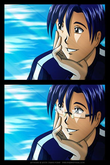
Ding by @jfong (Janna Fong)
I don't draw Joshua in glasses very often, but he does wear them for reading. I liked both versions, so I decided to post both. I originally had his glasses outlined in black, but it looked a bit wonky, so I erased them.
I tweaked my coloring in a few places. It's probably most noticeable in the skin. I used the gradient effect to add a bit more depth to the shadows. Not sure if it worked or not. I'll continue to experiment with it in the future. I also tried making sunrays that didn't stand out as being made through a photoshop filter. l used a tutorial last time in my Round Robin picture. I guess this is an update of that image in a way.
Hope you guys enjoy!
Drawn in Painter Colored in Photoshop


^_^ I like it when people post several versions of their pictures for when looking, others can compare the differences.
Both pictures are cute, but I have a thing for glasses/sunglasses, so I really like the bottom one. XP It also makes his face look fuller since it's kinda long to begin with. There's more dimension to his face with them on as well. ^^ Also reminds me that my glasses should be coming in today . . .
I like the new shading features in the skin. >3 Makes me feel stupid that I don't use a gradience, that's a good idea. XD Though I do like doing the shading, that's the fun part for me. Though that gradience does have a nice touch.
The filter is kewl (I like how the light rays kinda match up with the reflection on his glasses)! Which tutorial did you use??
Also, how do you keep your lines so neat and straight? XD Or probably a better question is: What equipment do you use to draw? I've only had my tablet for about two and a half months . . . but everything is obviously sketchy. XD;;; pokes her own gallery I love your art. X3 It's always so neat and clean and consistent.