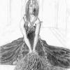
Again you've got the shading down great! Her pose is very neat too, the leaning on the page concept is very cool, and I think you've handled a complicated pose very nicely. The only critisism I could have, though it's only a minor thing is that the face looks a bit round, like her eyes, nose and mouth were just stuck one. It's not a big thing, and it's still a great pic, but it just caught my eye. Perhaps you could place the nose somewhat higher and let it curve more, so that you could see more of her left eye. Just a thougt though. Anyway, keep up the good work!

by @Dragon (Dragon)
Leaning on the page. Drawin i made for a bigger verson i did in inks. interestin i guess.


ohh WOW! i think this is really really good! lookin at it just makes u feel relaxed and the way youve conqoured the perspective is wikid! well done!!!!!!!!!
btw i think the feet r cool