@pippilee162
lee anderson

kirstyanne
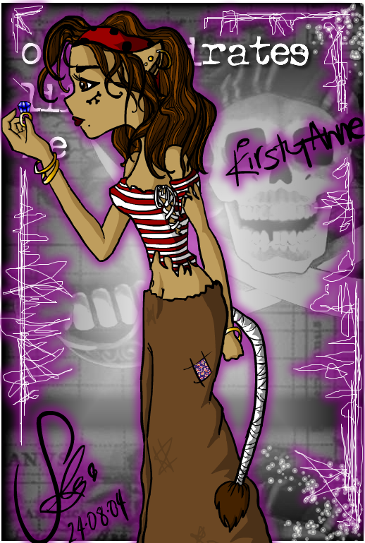
kirstyanne by @pippilee162 (lee anderson)

hehe.. another character of mine, kirstyanne.. named after a kinda cuz a mine.. shes a kewl kinda gal, n shes got beerrrrr mates... (private joke..:P)

this was kinda rushed, cos ive been trying to get myself round to finishing it for a while.. n u know when you just get fed up n rush ur way through? wish i had more patience.. lol.

her right arm looks reaaaaali strange, im rubbish with anatomy.. shadings pretty meak, but i like her hair neways, and the background looks alright..

comments n critiques gladly accepted!! Xx x

Category:
Rating:
Everyone
Class:
Finished Work
Submitted:
20y95d ago
Tags:
None
Other Work By @pippilee162

Comments & Critiques (7)

Preferred comment/critique type for this content: Any Kind

Posted: Tuesday, 24 August, 2004 @ 08:59 PM

The arm looks okay in position, but it is too long for her body and is longer than her left arm. Hair looks good though. The different colors blend well together.

Posted: Wednesday, 25 August, 2004 @ 05:24 AM

0_0 so thaaats it!! oh my god.. now i look at it its stupidly long:| i cant believe i didnt notice what it was... aaaah its so lonnngg!!!

arigatou gozaimasu for your comment/critique, :D its great to get an outside opinon, and especiali in cases like these, where i know theres a problem but i just cant spot what it is,

thank you loooads! Xx x
Posted: Monday, 30 August, 2004 @ 02:15 AM

Hey! This picture is really kawaii. Especially with her staring at the ring. One error which I find is that her hair/skull seems to be quiet flat, and not rounded..

Anyway, I'm just curious, but what software did you color that with? :S I really suck at coloring and I'm just a lost artist, looking for pointers.

Posted: Monday, 30 August, 2004 @ 06:15 AM

yay for comments ^^ yea i guess it does look a lil flat lol.. ah wel, heh thanks for pointing it outXD

i lined and coloured some of it with macromedia flash mx, then i used fireworks to finish it and do the glowy stuff ^^

thank you so much for ur comment!! Xx x

Posted: Tuesday, 07 September, 2004 @ 05:46 PM

What a cute character design! I've got a fondness for pirate-furres.

Aside from what people have critiqued, I think this picture's awesome. background's great, design is original, and I love how she's holding a ring. One thing you could have done to pull the picture just a little more is more dramatic shading. Nothing super intense, but something to give it a little more depth? Just a suggestion, I personally think it looks fine on its own ^^

We really should get around to trading, you know that? :D If you're interested, just lemme know since I'd really look forward to it!

Posted: Sunday, 16 January, 2005 @ 03:32 PM

I love this pic, its aceness knows no bounds. I really want those trousers! Ive put that in a comment on one of your other pics so now you'll probably think that im obsessed with clothes, you'd be correct with that thought. I like the coloruing of the hair and the face is very pretty

Posted: Monday, 17 January, 2005 @ 12:21 PM
lol thanks thats really sweet: )

the trousers are very cool. the kinda trousers you could climb a tree in, really comfortably lol

there's nothing wrong with being obsessed with clothes^_~ clothes rooock :D

hair took a while. infact it got kinda annoyin near the end

teehee

thank you for your comment huni!! i will look at your gallery soooooooooooooooooooooooooooooooooonn

luv pippileeXx x

Leave a Comment

You must be logged in and have an Active account to leave a comment.
Please, login or sign up for an account.

What kind of comments is pippilee162 seeking for this piece?

  • Any Kind - Self-explanatory.
  • Casual Comments - Comments of a more social nature.
  • Light Critique - Comments containing constructive suggestions about this work.
  • Heavy Critique - A serious analysis of this work, with emphasis on identifying potential problem areas, good use of technique and skill, and suggestions for potentially improving the work.
Please keep in mind, critiques may highlight both positive and negative aspects of this work, but the main goal is to constructively help the artist to improve in their skills and execution. Be kind, considerate, and polite.