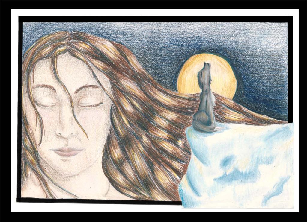
The colours are pretty saturated in the image, it just didn't show it as much in this scan. >.< But I will see what I can do, and thanks for the comment!

Calling II by @jeaney1 (Sara Timmons)
This is a revision of calling, a coloured pencil drawing previously uploaded to this site. I wanted to try and fix some of the problems I saw with the orignal and refine it some more. Comments and crits welcome & wanted thanks.
Comments & Critiques (4)
Preferred comment/critique type for this content: Any Kind
Oh, I like this one more than previous version (which is very good too). The picture elements are not so crowded together, and the white and black border adds interest to composition. Only one suggestion: when colouring round areas like the moon and the sky around it, i would try to follow the contour, instead of drawing straight lines. Anyway good job! :)
Thank you. ^_^ Sometimes I like redoing old pieces because you already know you can do it, and how much worse can you get, you can always make more improvement then you expect.
Around the moon in the sky I was trying to make the lines of colouring not that visible, but the moon gave me some problems lol I think that's one of the only things that actaully did come out worse >.<


This is also beautiful, like the first one. The face looks better, but I think the colors in the last one were more intense. I'd try darkening up areas, like the shadows in her hair and the sky, to make it stand out a bit more. I love the yellow highlights, though--that's an excellent touch to bring out the moon.