thanks for the comment! any critiques as far as the anatomy? (besides her blobby hands, feet and huge head :P)

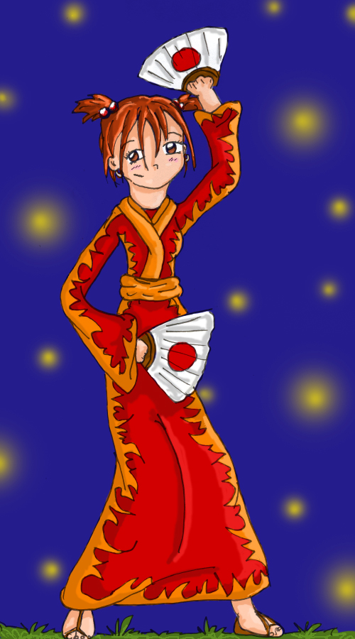
Fireflies by @Takker (Katie Panagakis)
just a doodle I did in art class when I was bored. I brought it home, colored it, and added a very simple background. I like the shading I did on the clothes though o.o
Comments & Critiques (4)
Preferred comment/critique type for this content: Any Kind
I hope you dont mind lots of critiquing. >.<
I love the clothes. One comment though, since the yellow is part of the design on the kimono it would be shaded as one piece, and not seperate from the red. In otherwords, see where you ended the shadow on the yellow, but hten started the shadow again on the red? it makes it look like two different parts, the yellow should be shaded over like it's a part of the red. and same with the highlights. Imagine it like one solid colour instead of two different. There are many more tips I can give on the shading, but I will leave it at that.
For the hands. Hold something in your hand and look how your knuckle looks. That should help some with that. WIth the sandles.. It looks like they end before they go under her toes, dont be afraid to add a little thickness to the soles of the shoes. and remember the straps have a thickness too, and try to show it in a 3-d form, not just like a ribbon.
For the feet, also look in the mirror at your feet from the side, or at someone you know, have the show you how their feet look, they should be about as long as her face, to be able to hold her wieght properly.
her neck is a little too thick. Her right side of her neck, is ok, but the left side should start a little more to the right, because it comes from behind her ear, and here it looks like it comes from in front of it. Her shoulders should equal 2 widths of her head. (each shoulder one width) that will help some with the anatomy. I also think her torso is a little small.
If you want anything else critiqued by me, or any more comments on this image let me know.
Besides these things that are off, I really like this, It's a good image, and good linework. The background works with the image, and doesn't over shadow it or look too plain for it. Except maybe make the line for hte ground slightly about her feet, it makes it look more like she's standing on it and not floating. >.<
I hope I helped! please let me know if I did ok in commenting.


She's so cute--I love her kimono. The pose is pretty well rendered, though the anatomy could use some work. She does look like she's dancing! Nice colors, as well. Keep it up!