Thank you! ^^ You make some really good points. I saw thoughs before, but my mum said I was nitpicking (hallucinating lol) Thank you again! ^_^

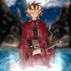
Samurai Katashi by @Church_Of_Ruins (Tegan Davis)
Just playing around with my new character samurai Katashi Shoda Sukiru. Made in Adobe Photoshop 0.6
Comments & Critiques (4)
Preferred comment/critique type for this content: Any Kind
The anatomy turned out really good here as did the expression. It's neat to see more samurai with glasses. XP It just seems to add character.
I assume those are supposed to be cherry petals floating about? Perhaps lighten them up a bit so they do look so heavy and that they'd drop like stones . . . The way he's holding the sword is a bit awkward for a samurai as well. The sword should be more aimed as going behind him so that if he must draw his katana, it'll be within reach. Time is always of the essence.
I love the coloring and how everything but him looks blurry. The bandages/wrappings around his hands turned out particularly well.
Thanks for your comment! =) Yeah, I do agree on the cherry blossom's petals being to dark, I will fix! ^^ I also see what you mean about the sword being in the wrong direction for an unexpected fight, Since this was the first picture I drew of him I was hurrying (hurrying is never good! lol) Also from hurrying I messed up his hands and could have made them look more realistic! --' But any way, Thanks for you comment!^__^


Wow, very nice. I am impressed. Your coloring style is very unique. My only quip is that there are a few white spots around the linework, and the lensflare looks out of place. But really, those are the only thing I would change. Beautiful work.