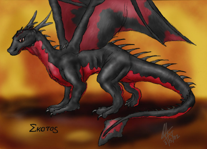
You've done a very good job with the highlights on this one! You're lines are all very clean, and I LOVE your style! I do have two suggestions thought >^^<;; First, I noticed that most of your pics face to the left. I have a similar problem, and I try to correct it by drawing all sorts of angles and directions. (It think the "to-the-left" habit comes from being right-handed, but maybe that is just me >0__o<) The second thing has to do with this picture... You've done a very good job with this one, and the highlights are PERFECT, but to make it more "three-dimensional", I'd suggest adding some backlighting (probably blue) to the places where the shadows would be deepest. Does that make sense? There's a good tutorial on that sort of shading on www.dreslough.com.
Whew..that was long! Seriously, though, you are very talented! Keep it up!
www.side7.com/art/jayckerr


wow! i love it! red and black dragons look good. my art: www.side7.com/art/zarathus/gallery.html