XD Yeah, the hair tuft came out odd. I hate when that happens... I am very proud of the hand, though. X3
Ah yes. Thanks for the tips. ^^ I still prefer hand-coloring, but every now and then I like to try something new.
@Lucky_Ladybug66
Daisy Hunt

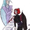
Behold my first attempt at computer colorization!
This is Alexander, the shadow of Alister's heart. Alister created him accidentally because of his intense self-hatred when he was being forced by the Orichalcos's control to attack Raphael and Valon.
Alexander could be called Alister's negative. He hates what Alister loves and loves what Alister hates. This means that he despises Raphael and Valon, but is highly fond of Alister (in a non-romantic way). His self-appointed mission is to kill Alister, because he believes that is what Alister truly wants.
His wings are symbolic (even though he really, physically has them). They mean that while he wants to do something treacherous, his motives are actually good. Alexander is childlike, without a true understanding of the pain that killing Alister would cause. Also, his hair is styled the way it is because that's the way Alister wore his hair as a child, and that's when his self-hatred first began.
I got the idea for Alexander from watching Magic Knight Rayearth. Nova is fascinating.
Preferred comment/critique type for this content: Any Kind
Ah, CG...or "the dark side" to trad artists XD
It helps to go back over things done with a lot of flood-filling in Paint...you can get all those pesky white spots with the pencil tool, or the paintbrush for larger areas. It's a pain, but it really does help sometimes pets her folder full of background tiles that wouldn't exist without it The little specklies do look sort of cool in his hair, though...reminds me of the sparkly-shiny hair on a My Little Pony I had somehow suspects Alexander would not appreciate that comparison
Also, if you're interested in coloring things on computer without going to the extent of shading and agonizing over every detail, you can make gradients of the colors you want, and after you give the lineart a good clean-up erasing, you can select and fill areas with the gradients...you can also apply different textures to the gradients using that method. It looks sort of cool when it's finished, and you didn't have to spend 12 hours blending everything together, but you still get a "shaded" effect.
Now...the wings...when you draw wings, it helps to remember that they're the arms/hands of the creature, or at least structured the same, especially dragon-type wings. If you have your arms down at your sides, then bend them upwards from the elbows, and then downwards from the wrist, you have the basic structure of a wing. The curve at the top of an angel wing would be the wrist, and the spike in the same area on a dragon wing would be the thumb. The bony projections that the skin is strung between are very long fingers (those are replaced by one very long finger in angel wings, though I've seen some Angel Sanctuary artbook scans that include a lot of very thin spines in the area as well). Then the skin or feathers should follow along the curve of the arm, so there should be indentation inwards on the side opposite the wrist area. Sorry for the over-lengthy description, but I'm weird about wings...had too many pictures criticized by my bird-freak grandfather ^_^;;
I like the feather falling away from the wing (the vanes! You included the vanes! cheers), and Alexander has a nice playfully-mischeivous expression...and he has sandals! Sandals are cool! just likes sandals
Bravo! Yes, enter the world of CG . . . BWAHAHAHAHAHAAAAA!!!
Trust me, I've seen people do a lot worse. XD;
I do love this pic and the pose. though the hair sticking up on the top looks a little . . . I dunno, like a vegetable top. XD;; I like the demon wing's anatomy and the blue touch to the wings was nice. ^^
For the demon wings, the claw like extrusions shouldn't probably taper off where they meet the skeleton of the wing. Instead fill out, as though they're an extension. And when coloring things in black, go back with gray where the lines were. XD;
The hand turned out particularly well on this, yay!