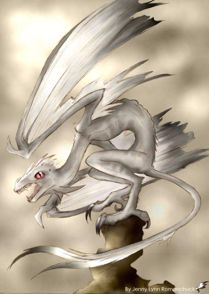
I wouldn't really call the coloring sloppy, just sorta unfinished looking, sorta like you haven't added in the darker shading yet. I'm not the most skilled at computer coloring tho', so my advice might not be the best.. I really like the overall color scheme for the picture and I have to agree with Shadowwolf, the teeth are cool, very sharp and pointy looking. Love the pose too ^_^

Red Eyes by @Ashwings (Jenny Romanchuk)
Coloring is kinda....sloppy The first dragon had a blue eye...but I figured the red eye made it look more....sinister n_n
Comments & Critiques (3)
Preferred comment/critique type for this content: Any Kind
Posted: Saturday, 06 March, 2004 @ 11:17 PM
the pose for this drawing is very nifty! I like the coloring as well. I tend to get a bit carried away with color and its amazing what a bit of white can do for the look of the picture. This is a quite spiffy pic altogether! No comments against it from me! Keep up the good work. ^^


Nuu, don't change the eye. Well, maybe make it a brighter red and a less pink color. But...I REALLY like the teeth! So spikey xP