Thanks for the help ^.^ And I see what you mean about making it more dramatic, I know some of it looks a little light right now, but in person it does look more saturated and darker.

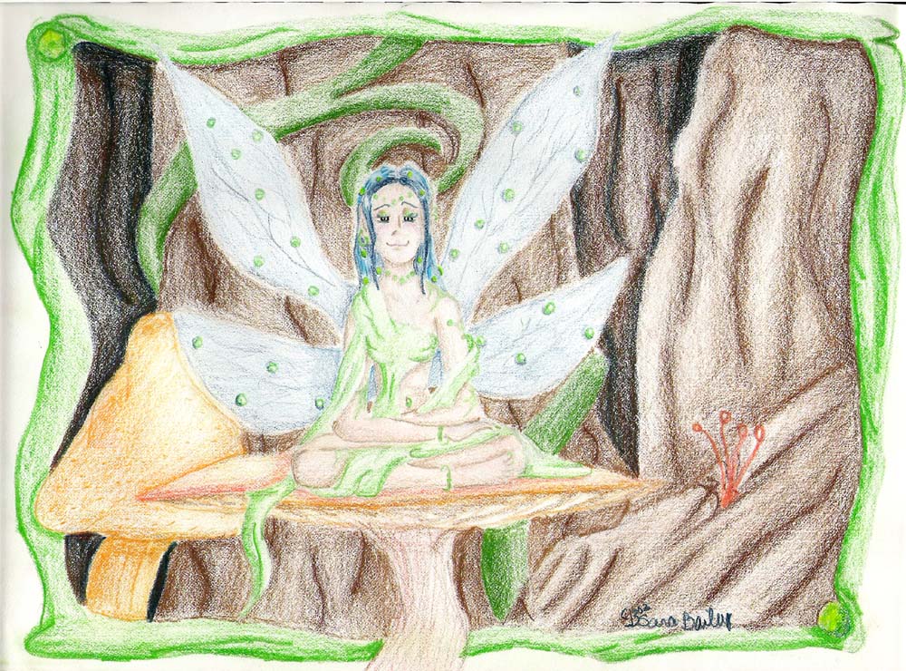
August Fae by @jeaney1 (Sara Timmons)
This was a gift for my mom for her b-day, in august.
I know that the arms look long, but she's sposed to be leaning forward, which also it doesnt look like. I know that, and so, if you know the best way to show her leaning forward.
comments and crits needed and welcomed
Comments & Critiques (4)
Preferred comment/critique type for this content: Any Kind


hmm, leaning foreward? I suppose the best way would be to show less of a waist, so it looks like she's bending foreward. but that's just me.
anyway, I like the green beads in her hair and wings! very cool. to make the image more dramatic, you could try outlining the picture and adding more dramatic shading, but your image looks fine as it is. nice work! ^^