@veralucia
Vera Lucia Emerim

Brazilian Earth Goddess
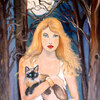
Brazilian Earth Goddess by @veralucia (Vera Lucia Emerim)

This is a homage to my homeland, Brazil.

Category:
Rating:
Everyone
Class:
Finished Work
Submitted:
21y56d ago
Tags:
None
Other Work By @veralucia

Comments & Critiques (4)

Preferred comment/critique type for this content: Any Kind

Posted: Saturday, 13 September, 2003 @ 01:21 PM

This is lovely! The colours are so vivid, it looks like an old advertisment. The only thing I can nitpick about is that her left eye (our right) is slightly lower than the other, but that's very minor. There's a very graphic look to this...it looks rather like a postcard. :D

Keep it up!

Posted: Saturday, 13 September, 2003 @ 01:46 PM

Thanks , deinse. i am working in this flaw . i always make diferent eyes. Lol. Maybe it is because i have problems with my own vision and an eyes seees less than the other. I know, lame excuse.

Posted: Saturday, 13 September, 2003 @ 01:39 PM

I agree, this does have the feel of an old advertisement, maybe a travel one ("Visit beautiful Brazil!"). I don't think your casual viewer is really going to be bugged by one eye being off; folks do it all the time in art.

I love the details in her clothing and headdress, they really add a lot of extra movement to the image that probably wouldn't be there otherwise.

Thanks for sharing!

Posted: Saturday, 13 September, 2003 @ 01:49 PM

Thank you for the nice comment!!!You are right about the "old look" . I was inspired by Carmen Mirand. She was a Hollywood Brazilian diva in the 1940... Only she used to wear bananas in her head....

Leave a Comment

You must be logged in and have an Active account to leave a comment.
Please, login or sign up for an account.

What kind of comments is veralucia seeking for this piece?

  • Any Kind - Self-explanatory.
  • Casual Comments - Comments of a more social nature.
  • Light Critique - Comments containing constructive suggestions about this work.
  • Heavy Critique - A serious analysis of this work, with emphasis on identifying potential problem areas, good use of technique and skill, and suggestions for potentially improving the work.
Please keep in mind, critiques may highlight both positive and negative aspects of this work, but the main goal is to constructively help the artist to improve in their skills and execution. Be kind, considerate, and polite.