dig the wings, dawg!! LOL, but i think the claw next to his face looks kinda flat. (just something i noticed) but a great job overall!!

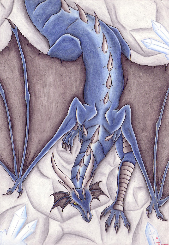
Dragon among crystal shards by @Noodle (Melissa T.)
Not the most original title in the world, yes, I know. ^-^;; I did this picture as a gift for yet another friend who really likes my artwork. I promised him I'd draw him something before the school year ended, and he always seemed to like my dragon pictures, so this is the outcome. I'm extremely happy with how the dragon itself turned out, a minor detail that I was really proud of for some reason are the veins in his wings. I feel that the background is really lacking though, I wish I could come up with some more creative ones for future pictures. Advice, anyone?
Done with faber castell pens and colored with prismacolor pencils on illustration board.
Note - My signature got cut off when I scanned it, I must not have noticed. ;_;
Comments & Critiques (3)
Preferred comment/critique type for this content: Any Kind
YES. I also had a lot of trouble drawing that hand. I wanted to make his fingers outstretched as if he were reaching to climb onto the next rock, but it came out a little more 2-D than I had wanted it to. Plus the crappy background added to the lack of depth in the picture.. perhaps I'll do better next time. Thanks for your comment and observations :)


That is a really cool dragon and i think the crystal shards just needed to look clear or something but it is still awsome ..great job :p..