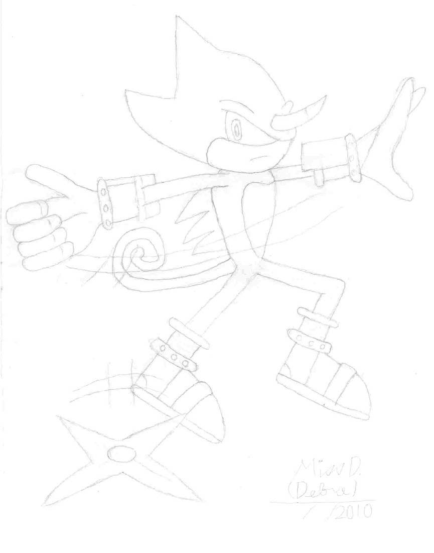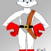
-CRITICISM NEEDED!- Espio Throwing Ninja Star by @Weasel_Silver24 (Miss D. (Debra))
Hey! I have this idea in my head of "Espio" throwing a "ninja star" and the ninja star looks like it's coming right at ya. Like it could come right out of the paper, you know - like "Superman's" fist coming right out of a comic book. This picture was done on a "9x12" skatch paper. I really like to know about the ninja star, does it need to be little bigger or, move down or up, or is it okay. PLEASE COMMENT, PLEASE. Thank you.
COPYRIGHT NOTICE: Espio The Chameleon belongs to (C) Sega. This drawing & idea from (C) 2010 Miss D. (Debra)
Category:
Rating:
Everyone
Class:
Work-In-Progress
Submitted:
14y256d ago
Tags:


Nice motion in the pose. As for the ninja star, it's a little low down the page, making it look less like it's coming straight toward the viewer. I would move the star up on the page, probably as close to center as possible. Try to picture the trajectory of the star as it's flying through the air directly towards you - where it starts, and where it's supposed to end up.
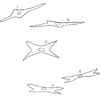
While you have a good perspective on the star as it is, from the proper angle, you'd see a little bit of a side view on it as well. It's difficult to pull off, as those stars tend to be thin and you wouldn't be able to see both sides of it, but showing the edge of the points as well as the ridge down the center would help make it seem more like it's coming straight toward the viewer.
Hope this helps. Happy drawing!