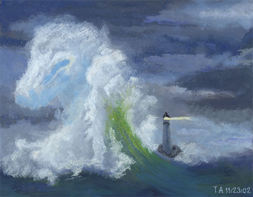
Hrmmm OK I talked with my art-teacher Eva about it and she suggested more contrast. The darker the sky and the water is, the more the lighthouse will be lit up. Hopefully that will help or something...

(Currently Untitled) by @kristensk (Kristen Sharpe)
This has been a really frustrating piece for me. I've been working on it as a potential piece for my portfolio (now, there's a laughable idea) for the last several weeks. I'm starting to view it more as a learning experience than something I'll ever want in the portfolio. But, at least it is good for that much, and I do still like the concept behind it.
However, I'm rather stumped as to the handling of the water and sky. I've been told both that the sky needs to be darker and more threatening and that it needs more color. I'm not at all sure how to balance those two notions and any suggestions would be welcomed.
Artwork © Copyright 2002 Kristen Sharpe
Comments & Critiques (3)
Preferred comment/critique type for this content: Any Kind
Average Rating:
(5)
Now I'm not trained in colour theory, but I personally have no complaints about the palette. One supposes the water could be darkened to better contrast against the clouds, though even if it's not intentional I find the melding of sea and sky poetic.


Hrmmm....I´m not sure about it...maybe I could print it out and show it to my art-teachers? They are pretty good at stuff like this..but else, I think this is a very beautiful piece of art! Even if it's currently untitled.