@Ashwings
Jenny Romanchuk

Weathered
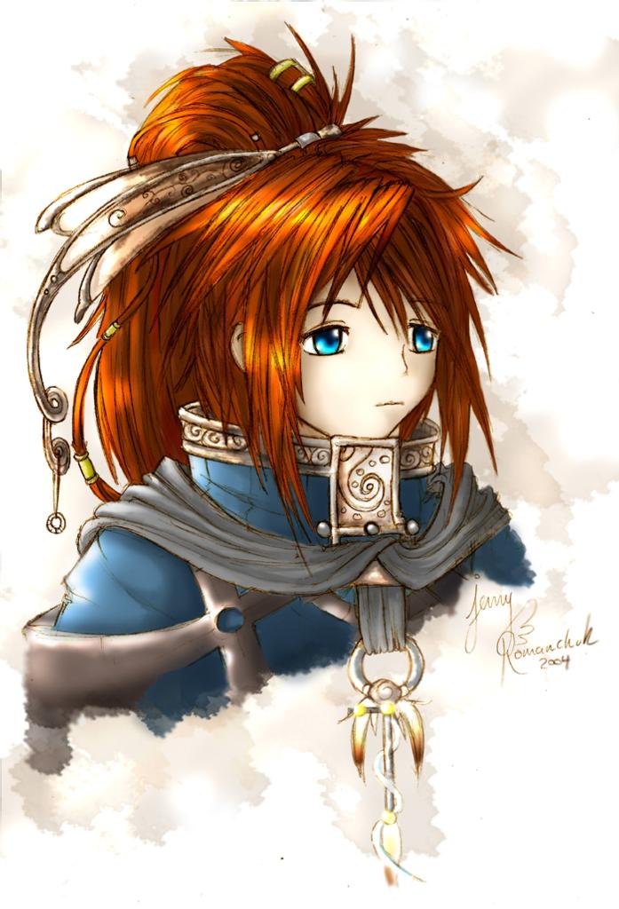
Weathered by @Ashwings (Jenny Romanchuk)

I made it look kinda watered down-like but not in a way... Umm...I'm never was good at writing discriptions..Took me all day to color...I actually tried to do a half decent job... Just a random person...I like her n_n

Category:
Rating:
Everyone
Class:
Finished Work
Submitted:
20y264d ago
Tags:
None
Other Work By @Ashwings

Comments & Critiques (5)

Preferred comment/critique type for this content: Any Kind

Posted: Monday, 08 March, 2004 @ 06:44 PM

I can see why the coloring job took you all day! It looks amazing! Very good work! ^^

Posted: Monday, 08 March, 2004 @ 07:24 PM

Awesome piece! I really like your coloring. I especially like how you colored her hair. You always do such a nice job. ^_^ Her costume has a very interesting design! The thing hanging from her collar looks neat. XP Her hair ornament is also very cool.

For improvements, I would add more depth to her face. Compared to the rest of the image, it looks a bit flat. Other than, everything looks good. Spectacular job! ^_^

Posted: Monday, 08 March, 2004 @ 07:51 PM

drops to knees Noooooooooooooooooooooooooooo! LOL. Ah well n_n;; I COMPLETELY forgot about that! XP Must improve! Thanks alot for the comment!

Posted: Monday, 08 March, 2004 @ 11:45 PM

Aaaaaaah, awesome!! She looks so pretty, but sad... she looks like the kind of person that would actually in fact be a healer with some dark past. o.o Yay fun..! I love her hair.... it's so fiery. X.X!! Shiiiiiiney pets her XDa

Looks like you could illustrate protraits for stradegy games. u.u You know, for the dialogue thingies? XP That would be cool. XDa

Good job. I am blown awayaaaaaz n_n + ~koko

Posted: Thursday, 11 March, 2004 @ 06:15 PM

Wow, this is very beautiful. I have to agree with everyone else, her hair does look very good. I love the highlights, it makes it look almost on fire. Very nice clothing design, the little details look great, very creative. Her face does look a little flat, but you know what, it almost works out fine because her eyes stand out on it that way. They look very three dimentional and expressive, and it is such a clear and bright color that it makes them the focus of the face. The only thing I would add are a little more lashes, but maybe you were hoping for a more innocent look by not adding them.

Leave a Comment

You must be logged in and have an Active account to leave a comment.
Please, login or sign up for an account.

What kind of comments is Ashwings seeking for this piece?

  • Any Kind - Self-explanatory.
  • Casual Comments - Comments of a more social nature.
  • Light Critique - Comments containing constructive suggestions about this work.
  • Heavy Critique - A serious analysis of this work, with emphasis on identifying potential problem areas, good use of technique and skill, and suggestions for potentially improving the work.
Please keep in mind, critiques may highlight both positive and negative aspects of this work, but the main goal is to constructively help the artist to improve in their skills and execution. Be kind, considerate, and polite.