+ Icky + by @block10 (Andrea Mickelsen)
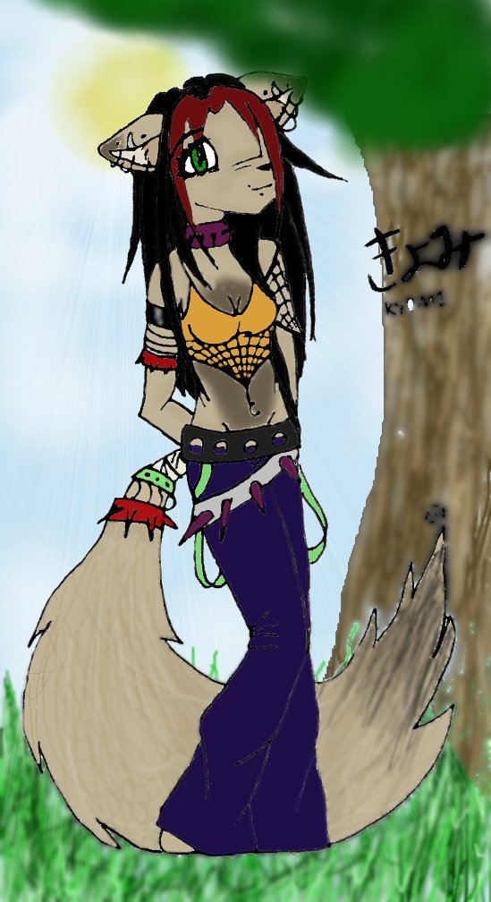
This is a horrible picture. Im only uploading it coz I lvoed the line art. Now... omg. Okay where to begin. THe colouring ist that great, the background is so icky. THe grass looks like a kindergarteners, the sun is pathetic, the tree is like something out of a horror movie made by a first grader, and it all looks so bad! Ah well.. now i can look back on this and suprise myself at how bad i was. Anyone have tips for cging? I ened em .. lol
Category:
Rating:
Everyone
Class:
Finished Work
Submitted:
21y ago
Tags:
None


Unfortunately, I have no advice on CGing, but I can tell you were to get some help--Side 7's message board. We have a section about Art Materials--I am certain you will get help there if you post your image and explain your problem. Remember, you have already improved from your starting point because you even tried to CG. So don't give up--you definetly will look back on this and think "Wow. I have gotten so much better!"
And your character design is excellent.