@zarathus
zara thus

Light and Dark
Light and Dark by @zarathus (zara thus)

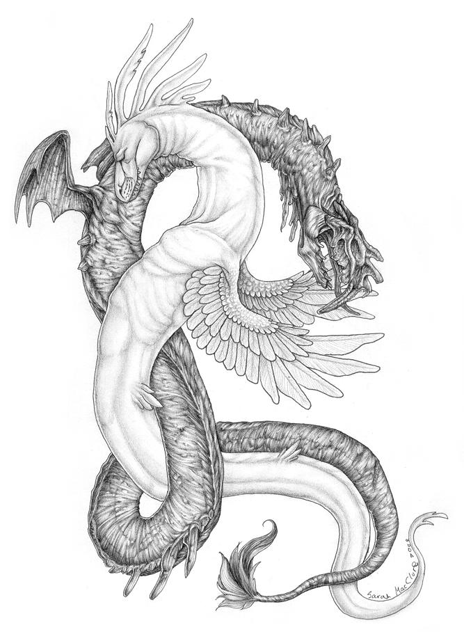
The darker one took me forever to do...while the lighter one only took a few hours.

The idea came from something which happened a few months ago now. Only...the original idea...had the darker one more...around the light one.

Category:
Rating:
Everyone
Class:
Finished Work
Submitted:
20y186d ago
Tags:
None
Other Work By @zarathus

Comments & Critiques (7)

Preferred comment/critique type for this content: Any Kind

Average Rating:
(5)

Posted: Wednesday, 26 May, 2004 @ 07:45 AM

I love the concept of this image. It is so elegant. The shading has been done just beautifully, and I admire the creativity put into the dragons. In my opinion, the only thing that could be improved would be to have the light one's eyes showing. That might make it appear more "good".

Posted: Wednesday, 26 May, 2004 @ 03:15 PM

I love the imagery! Especially how both figures are entwined like that.

The darker one looks particularly amazing, and it's easy to tell that you put a lot more time into it, which isn't the say the light one doesn't look good (it does) but it lacks the fine details.

I think it would look better if the light one's wings weren't so darkly outlined though.
Posted: Thursday, 27 May, 2004 @ 03:37 PM

Very nice dragons. Excellent poses, space filling and skin texturing (especially on the dark one)

Posted: Monday, 21 June, 2004 @ 08:44 PM

this is wonderful! You've gotten better! hehe... maybe you don't remember me.. I'm at D/a now long time no see, your doing very well ^^ keep it up Zara.. =3

Posted: Friday, 03 December, 2004 @ 05:53 PM

Le sigh. I do so envy your shading, so clean. Good job on creating the dark creature all creepily, I feel bad for the light one.

Posted: Friday, 26 December, 2008 @ 05:14 PM

I especially like how you made the miscellaneous little protrusions (horns, flipper-things) on the dark one look really creepy, while the ones on the light one (frill, winglets) look inherently beautiful. I find the dark one's face particularly captivating - it's very gross and inhuman-looking - while the smoothness of the light one suits it very well - it gives it a real sense of purity. The dark one looks very dead, or like it represents death and rotting things, while the light one is clearly full of vitality and peace. ...

I could go on and on about this piece, but I shan't take up more of your comment space. I really love it. ^^

Posted: Thursday, 21 July, 2011 @ 10:56 PM
Rating: 5

Astounding job. I can definitely see the dark one taking quite a bit of time, and it was worth it.

Leave a Comment

You must be logged in and have an Active account to leave a comment.
Please, login or sign up for an account.

What kind of comments is zarathus seeking for this piece?

  • Any Kind - Self-explanatory.
  • Casual Comments - Comments of a more social nature.
  • Light Critique - Comments containing constructive suggestions about this work.
  • Heavy Critique - A serious analysis of this work, with emphasis on identifying potential problem areas, good use of technique and skill, and suggestions for potentially improving the work.
Please keep in mind, critiques may highlight both positive and negative aspects of this work, but the main goal is to constructively help the artist to improve in their skills and execution. Be kind, considerate, and polite.