Thanks! And yes, I do agree with you about the colouring. Could've been done better. :p I was thinking of leaving some highlights to outline her body and wrinkles in the clothing, but it din turn out as expected. Bleah.

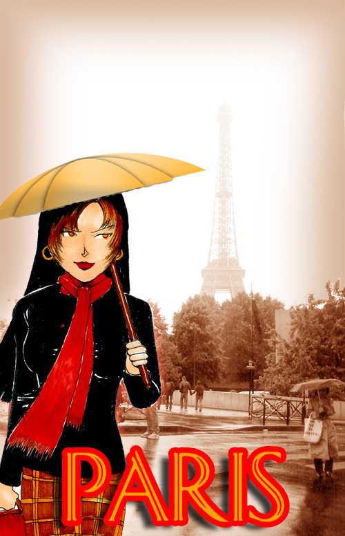
Parisian Gal by @boredslacker (Aki Tan)
Because I miss the place... sigh... The photograph was my very first view of Le Tour as I emerged from the Metro. That day, it was drizzling, so the outline of Le Tour wasn't too clear, but still distinct. Despite the rain, I got what I think is a pretty original shot of the Eiffel Tower. :)
As usual, the gal is done in pen, ink and Copic, and then pasted onto the background. [which incidentally, is my photograph as well] The photo was, well, heavily photoshopped to get the sepia effect, and then text was added.
Overall, I'm happy with the effect, though I do think the girl could've been better coloured. I was actually trying something along the style of one of my favourite illustrators, but well, my own style overpowered it in the end.
Comments & Critiques (5)
Preferred comment/critique type for this content: Any Kind
Very nice. I love the photo you took, it's really amazing. I hope to go to Paris someday... Anyways, it seems you might have the same problem I did when coloring--leaving out highlights. It's really a tough thing to get over--but I recommend just coloring a lot less than you think you should. After all, you can always go back and add more shadows, but it's more difficult to add more highlights! Also, white paint pens can be used to add highlights later. I love her skirt, but her expression seems a little peeved? I'm not quite sure what it means. Anyways, great pic!
I've tried a white pen, but it doesn't give the effect i want, because the colour still shines through.... maybe because the ink isn't thick enough... bleah....
and the expression...... supposed to be a slightly upturned smile...... looks like it wasn't upturned enough........ bangs head on table


Lovely work. The photograph alone could be a postcard, but with the girl in front and the text, that just adds to the effect. The coloring is a little choppy in places, but as a whole, it's nicely done. She does look like she fits in there. Nice work.