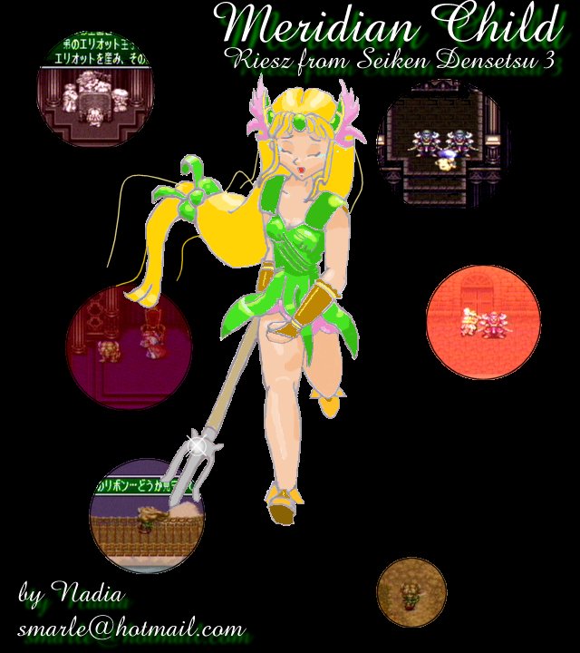
This is a great image, and the small screenshots really add to the effect! Besides the chunkiness from the pencil lines in the CG, it looks really good! And Reisz's story is probably the most touching of all the backstories, besides maybe Carlie's, but you know I'm partial about that. ;) Great fanart for a great game!

Meridian Child by @smarle (Staci/Nadia)
This picture is ancient, from back in 1998... ^^;;;; At the time, Riesz was my favorite Seiken Densetsu 3 character, and her opening story was so tragic. Just before the credits roll, she runs down the mountain where her home is in tears with the song Meridian Child playing in the background (hence the title). I really loved that scene and wanted to draw it. At the time, I only had Paint Shop Pro and no inking pens, so the outline is only in pencil, and Riesz was colored more primitively, almost in a cel style. But still, I loved drawing the feathery material in her headdress and I like how the highlights on top of her head came out. Drawing the pose was a little difficult, but I think it came out well, except for her front foot, which looks really wrong... I tried to make little bits of her hair come loose from the rest of it, but... it looks pretty bad... ^^;; Oh, well... It IS an early work, and it does still have good points about it.
As for the background, I'd originally intended to draw the mountain and have the portrait of Riesz (which should be above this one) in the upper left corner, but I couldn't make the background (I really need to work on good backgrounds--even five year later, I have trouble... ^^;;;). So what I wound up doing was hooking my SNES up to the computer and taking screenshots of her opening, then lining them up in the background, putting black over them, then making little circular holes over the events of Riesz's past. While it's not what I'd intended, I like the effect, because it actually shows what happened to cause her to leave... Her mother's death long ago, her brother getting kidnapped, her father killed, her kingdom taken over... then her talking to her parents' spirits and running down the mountain in tears. The only problem was that I made some circles kind of jagged... Also, looking it now, I think Riesz herself takes up too little space...
One day, I'd really like to redo this picture and see how I've progressed in time.
Comments & Critiques (5)
Preferred comment/critique type for this content: Any Kind
The foot actually doesn't look as awkward as it might, I think the right hand (her left) looks weirder than the foot. The headress was done well, and as you said the highlights look good. I think, with the loose strands, if you blurred them or did them lighter they would look good, and it was a good idea. The bubbles are also cool, but I would be interested in seeing you redo this with another background!
Hmmmmmm, I can see what you're talking about with that hand... It's so small... O_O;; I used to draw such tiny arms and hands... ~shudders~ I don't remember how exactly I did the hair strands... Maybe I didn't anti-alias or something... That might explain it...


So pretty! Is this really that old? O_o I'd love to see an updated version! ^_^