@JesterAG
Al Gonzalez

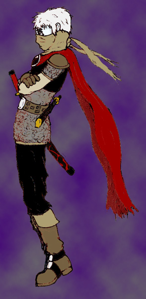
Jerrick - Color test
Jerrick - Color test by @JesterAG (Al Gonzalez)

Jerrick again. This time in color! This is just a test phase right now. Any feedback is much appreciated.

Category:
Rating:
Everyone
Class:
Work-In-Progress
Submitted:
21y2d ago
Tags:
None
Other Work By @JesterAG

Comments & Critiques (2)

Preferred comment/critique type for this content: Any Kind

Posted: Friday, 26 December, 2003 @ 03:41 PM

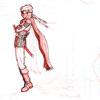
It's looking good so far, Al. Is the red thing a cloak or a scarf? After looking at it a while I think cloak, but at first I thought it was a Shinobi-esque scarf. Anyway, sorry for the very belated comments. I like the boots and the overall design...the colors look pretty good, but that purply background does nothing for them. I think with the proper shading and background this could look quite nice. I do have to ask about the pose though....it looks like he's about to fall over; the weight distribution is rather odd. I know he's standing on a rock on the original sketch, but it still looked like he was floating or something. Is he just doing something monkish? Oddities aside, I think you have something good going that's worth finishing, if you haven't already ^_^

Posted: Saturday, 03 January, 2004 @ 11:35 PM

Let's take care of the Q's in bullet form, shall we? Red thing: Cloak, with a large, shiny, opal stone as the clasp. Pose: The weight is on the balls of his feet and as the cloth suggests, he's kind of fighting back a wind. Background: Very arbitrary stuff. It wasn't meant to be special, just contrasty-ish...stuff...you know, to help make Jerrick stand out.

Stay tuned for Jerrick in 3D in the semi-near future!
Leave a Comment

You must be logged in and have an Active account to leave a comment.
Please, login or sign up for an account.

What kind of comments is JesterAG seeking for this piece?

  • Any Kind - Self-explanatory.
  • Casual Comments - Comments of a more social nature.
  • Light Critique - Comments containing constructive suggestions about this work.
  • Heavy Critique - A serious analysis of this work, with emphasis on identifying potential problem areas, good use of technique and skill, and suggestions for potentially improving the work.
Please keep in mind, critiques may highlight both positive and negative aspects of this work, but the main goal is to constructively help the artist to improve in their skills and execution. Be kind, considerate, and polite.