
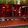
@Thorvald: I could get deeply philosophical and off topic with this (and kind of shooting over my own goal too), but it seems like we sort of de-evolved over time. There used to be a music player on the site for example, something that I think is *very *rare these days. Somewhere along the way all of the cool stuff and quality of life things that I would have enjoyed stopped being cool for some reason. Now it is all dark shades of grey (not 50), minimalistic UI, sleak modern emptieness, big chunky icons, unfun and cold. I think that is the essensce of what I wanted to convey with this image. I want (some) of those things back after a decade of utter boredom.

Casual project.psd by @ragukokarn
So because this site triggers some major nostalgia in me, I figured this fits perfectly. This is pretty much what digital art looked like a long time ago. Obviously not all of it, but a lot. The combination of text, shapes and complex patterns really was the design language back then. I dunno. I like this stuff. It is relaxing to make, that is for sure. I even slapped some Impact font in there to really sell the 2000's vibez.
Category:
Rating:
Everyone
Class:
Finished Work
Submitted:
181d13h ago
Tags:
Comments & Critiques (3)
Preferred comment/critique type for this content: Any Kind
Average Rating:
(5)
Average Rating:
(5)
Posted: Friday, 24 May, 2024 @ 09:45 PM
@ragukokarn: By all means, fork a tangent: I only just backed off drawing a direct contrast with the recent trend of streamlining and simplification. Onboard media players were probably axed as bandwidth sinks that posed liabilities as sites grew, but I imagine much of this was a casualty of the corporatization of "Web2.0" metastasizing around 2010: why splurge on personality when the bare minimum will save you a penny and boost mass-market appeal? 
Blimey, this does take me back! Early 2000s CGI was definitely an aesthetic; it sometimes leaned a little too far into technoise for its own sake but it had so much personality. Just look at that vintage UI! B^D I don't know what they're called, but the cones perfectly evoke those poles at a transformer station.