@Jansu
Brandon Ballenger

Helping Hand
Helping Hand by @Jansu (Brandon Ballenger)

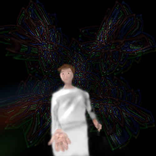
Started out as something random well over a week ago, with the design for the stained glass. Which wasn't really going to be stained glass to begin with, but most things I do don't end as they start. Then I decided to try another figure, so I did this priestly guy. He's supposed to be bending over and offering his hand, but. It didn't come out that well. Despite that I did it over four or five times. More or less given up on it for now.

I tried to do more realistic eyes and somewhat bolder shading with this, and I'm not too terribly displeased with either. The shading is undoubtedly off, but it was a bizarre lighting situation at best and the pose didn't help any. Oh well.

Category:
Rating:
Everyone
Class:
Finished Work
Submitted:
20y156d ago
Tags:
None
Other Work By @Jansu

Comments & Critiques (8)

Preferred comment/critique type for this content: Any Kind

Posted: Thursday, 24 June, 2004 @ 02:16 PM

Looking good, Janus! I dig the shading on his clothes (dodge & burn?) -- it would look even better if you shaded his bottom half as well. Cool face from what I can tell, but it's kinda hard to see. You did well with (another) difficult pose -- one thing that would make him look more like he was kneeling over would be to shorten or even eliminate his neck. I like the contrast between the background and figure -- it creates an odd mood that I can't quite place. Keep it up ^_^

Posted: Thursday, 24 June, 2004 @ 07:20 PM

Yes, it was mostly dodge and burn, but not entirely, in some cases I just airbrushed the color on because it wasn't going where I wanted. Certainly couldn't with the hand for one thing, it turns orange when you burn, which is no good. As it is it looks a little scarred or something, but.

I couldn't decide how to shade the lower half, and I was having toruble how to make it seem like he was leaning over, that's about when I quit. Any suggestions on how you think it would be shaded, legs straight?

Yeah, I hadn't thought of removing the neck, that's a good point. I should really try and think these things through a little more.

Thanks for commenting. ^_^
Posted: Friday, 25 June, 2004 @ 04:30 PM

Ahhh, now I see ... so the stained glass is kinda supposed to be the ceiling & walls? Awesome.

Ok, well, if he's supposed to be leaning over with straight legs, there should probably be some horizontal wrinkles around the hips where he's bending over -- you already have a couple. Then follow the drape of the fabric....which gets kinda tricky if this guy is being looked at from below. If you have some available, maybe you could try looking at some curtains or a dress to see how it falls.

Posted: Thursday, 24 June, 2004 @ 06:56 PM

Yaaaaaay, more Ja-kun art! The stained glass is a really pretty effect--it almost seems kinda fractal-ish in the patterns... Definitely looks realistic. Nifty work with the foreshortening and all the perspective stuff... Definitely good for a start and for not having lines to help you out... I think the face is my favorite part of the priest... The shading seems just right there. Like Amy said, the top of his robes has some nice shading/highlighting, too... The part that seems oddest to me is the shading of the extended hand... Though, some of it might be because of compression? I think he's missing ears, too, actually... ^^;;; Just keep practicing, and everything will continue to improve! You're doing great! ~ok~

Posted: Thursday, 24 June, 2004 @ 07:23 PM

It's not a fractal, it's actually more of a five petal flower, which I duplicated and layered over itself in different colors in different positions. Then I distorted the perspective, though really the persepctive is quite horrible. Or rather the figure is, he should be entirely doubled over if you're looking straight up. But I didn't put as much thought into it as I might've.

I didn't compress it much, that's mostly my own doing there. What do you think is off about it, particularly? And yes, he's certainly lacking ears. Maybe I'm going to have to revisit thihs after all.

Thanks for commenting. :)

Posted: Friday, 25 June, 2004 @ 09:39 PM

Maybe make it so the viewer isn't looking straight up, but maybe at an angle from the ground up? You'd probably have to shift the background a bit to compensate for the change, but it might be easier to work with... Maybe...? ^^;;;

As for the hand, I think maybe there's a bit too MUCH shading/highlighting... There should be shading under the robe sleeve and on the underside of the hand (you'd do that by shading the very left and/or right of the fingers), and maybe some light highlighting on the top of the hand...

Did that help?

Posted: Saturday, 26 June, 2004 @ 02:56 AM

There's a word for what this picture is... Something from the Renessance that I just can't remember the name of... If you check the log, you'll see I bugged Amy about it but she was of no help... [sigh] Soooooo.. Let's just say... That it looks... Very Renessance and leave it at that... ^^;;;;;;;; It definately shows improvement over your last pictures though, and that's a good thing! ^^

Posted: Saturday, 26 June, 2004 @ 09:12 AM

Renaissance. And yes, I saw. Sorry you couldn't come up with whatever it was...

Thanks for commenting! ^_^

Leave a Comment

You must be logged in and have an Active account to leave a comment.
Please, login or sign up for an account.

What kind of comments is Jansu seeking for this piece?

  • Any Kind - Self-explanatory.
  • Casual Comments - Comments of a more social nature.
  • Light Critique - Comments containing constructive suggestions about this work.
  • Heavy Critique - A serious analysis of this work, with emphasis on identifying potential problem areas, good use of technique and skill, and suggestions for potentially improving the work.
Please keep in mind, critiques may highlight both positive and negative aspects of this work, but the main goal is to constructively help the artist to improve in their skills and execution. Be kind, considerate, and polite.