Ok...like it says, mature viewers ONLY.
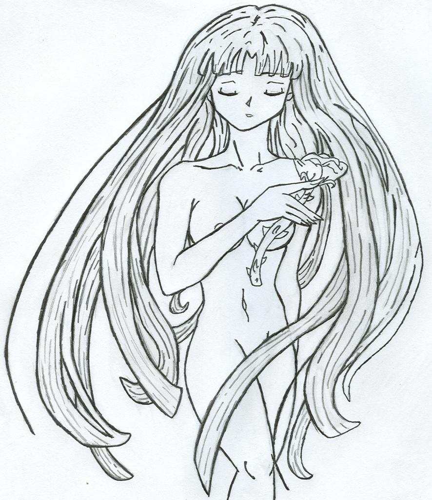
I didn't mean this pic to be sick in any way, shape, or form. It was merely to test my anatomy...and because my dad reminded me of a time when nudity wasn't considered gross and sick and XXX, and that's stuck with me since...it kept nagging at me at the back of my head until the point where I had to draw it out.
Her nipple, to those who wonder...you can't see all of it. Just part of it, k? So it is anatomicaly correct ;P
The rose is there because her flower is the rose^_^;;
Sorry if my scanner distorted or darkened this at all...it shouldn't, but it might have.
Her leg may look short, but it's not-.- It's just bent (NOTE THE KNEE!!!!!!!!!), so you don't see the whole leg, making it appear shorter. Her other arm is also bent, only it's bent back. You NEED to keep an open mind on this pic, and CONSIDER posibilities like that, instead of right off the bat dissing my anatomy here-.-
I dunno when, but I plan to color this pic.
Other then that...I'm happy with it^^;;
And that's all I have to say...and now for...drumroll the copyrights! Woot!
Kali © Kal_Chan (me)


Pretty nice anatomy here. Better than some anime I've seen. The pose and expression are very expressive here and I like the way the hair's flowing around her. The rose is a nice touch, too.
A few minor things are off with the anatomy. Her right forearm, which well drawn, is too long for her upper arm. I think the problem there, though, is that her upper arm is slightly too short. The knuckle of her index finger needs to be out further to line up with the rest of her fingers, though I like the way her hand is drawn otherwise, especially the nails. Her torso needs to be a bit longer. Right now, you seem to have the bottom of her ribs, the narrowest part of her torso, as the waist, when the waist is a little further down the body. The hips are nicely drawn, though her right upper leg looks a little too thick for her other leg. From this angle, the outside curve of both legs would match. Her legs are also too short, at least what of them we can see. An easy way to think of it is the upper leg, from crotch to knee, should be about as long as the distance from the shoulder to where the hip connects to the leg.
This isn't an anatomy issue, but her hair could use a little work, too. The strands you've drawn have a good flow to them, but they're kind of blocky and seem to have an odd shape from the detail lines you added in them. When you're detailing hair, don't use only lines of the same length, and have them twirl around the hair a little more. I'm sorry I can't explain it better, I suppose the best thing to do is study real hair and art that depicts it well and see how they make the lines make the hair look full and real.
And finally, her nipple should be just slightly further outward, toward her arm, than it is.
Despite all that, though, I think this is a really nice picture. You've captured something tender and perhaps sad in this picture and it has a nice feeling. And most of the anatomy is drawn quite well, particularly the face. Outline of the face could be centered a little and the nose moved a smidge to the left, but what you have is still lovely. You have the curves and size of the body just right. Keep working on it, you're doing quite well so far. Hope to see more from you.