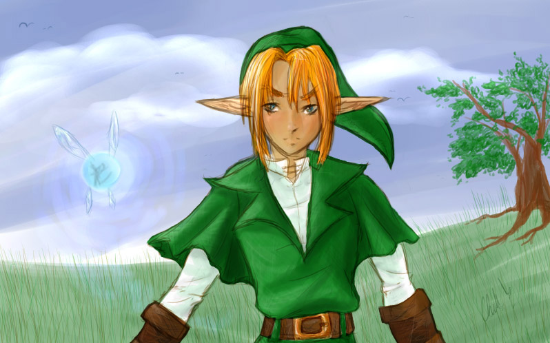
Lovely sketchy style, makes the picture look very soft. Link is very nicely shaded, and though it looks a little feminine, I think the subtle red on his cheeks is a nice touch.

Link and Navi by @klawzie (Chella Reaves)
An OpenCanvas sketchy painting of Link and Navi on a hill somewhere - I suppose - in Hyrule. I detest the grass, but that's why I won't count this as a 'finished piece'. I like almost all of everything else, though. If you'd like to see the .wpe, let me know and I'll link you to it.
Comments & Critiques (6)
Preferred comment/critique type for this content: Any Kind
Link... Hot.. drools there's a manga series!?!?! are you serious!?!?! where?!? rabid fan*
the colors are wonderful and the clouds look so poofy hugs the couldspoof!* I'm surprised you actually put Navi in there though, beings that there are so many Navi haters out there. (Mind you I find her very annoying, but she happens to be rather usefull ya know?) pinches link's cheeks so cute!
http://www.bsu.edu/web/agscherer/manga.html <-- Someone's translated them here. :) Be sure to check out the rest of her site! She has other goodies that are worth a look too!
I also bought all five ( I think just five official ones, anyway! ) off of Ebay. (I'm keeping an eye on ebay for more, but they only seem to want to sell them in 1 or sets of 2 instead of a full lot like I bought mine. ;p I want to buy a set for my boyfriend too. ^^; There are tons up on Ebay up at the moment, though! But in Japanese, of course...)
Er, oops. Forgot to complete my thought before sending. :D
Also - The only Legend of Zelda related game I've ever played is Super Smash Bros: Melee (GameCube) - so I've never actually 'met' Navi. :D I know she's horrendously unpopular, but she's easy to draw and can take up space in an image that would normally be blank. XD


Wonderful picture. The colors are especially nice, very subdued and gentle. The clothing folds are believable, especially on Link's sleeves, and the bounced light -- shading the white sleeves with tints of blue and green from the surroundings -- is effective. I also like the use of a non-black outline for the picture elements, as well as leaving the background somewhat impressionistic. Very nice, especially the clouds. I also like the grass, which is a wonderfully gentle effect. A very serene scene.
A note about color perspective: as you're obviously aware from the grass, the further your scene goes into the distance, the more "blue" it should get in a clear, outdoors setting. As mentioned, this works really well on the grass to the viewer's left of Link, but falls a little short on the tree, which looks flat. To give it more depth, I would suggest painting different "layers" of leaves and branches, starting with the ones farthest away from the viewer, which would be the most blue in tone. As the branches and leaves get closer, they would get more and more of their color. In this picture, you have left the tree somewhat translucent, letting some blue show through, which puts it clearly in the distance. However, compared with the grass at its base, it seems to be closer, which makes it look a little off.
Great job, keep up the good work. Cheers. =^_^= -- Tails