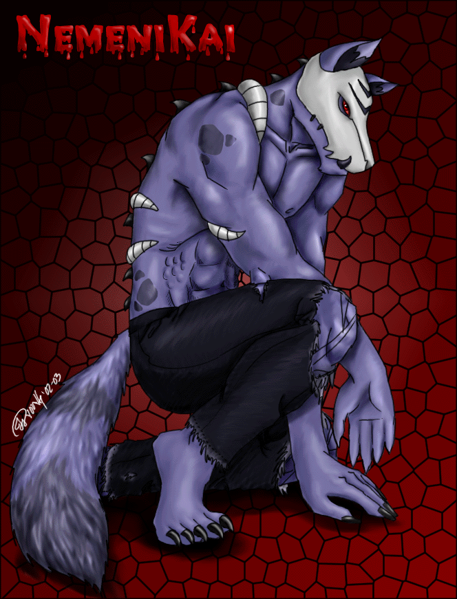
i like the balance of colour. the anotamy is well done, too.
www.side7.com/art/laurrodi
@odduckoasis
Julie Ottosen

I was looking at some old pics of mine, and I'm just like.. blegh! So I had to redo them. I did this first. This is my Kai. The first pic I ever did of him. I redid the coloring on his tail, looks more furry and natural now, I redid his toes, his hand his mask his eye and his spikes on his back. I had to redo the hand, cuz I hated the gun, so I just took it out all togther. So there you are. I likes it a lot better now.. I also smoothed his fur/skin out better as well. noddle So yeah.. meas likes now. =D
Kai © me!! 2002-03 Artwork © Copyright 2003 Julie Young
Preferred comment/critique type for this content: Any Kind
yesh, mesa did realize these things when I fixed them... the toes didn't turn out at all.. it sux really.. XD and the hand actually that use to hold the gun is smaller compared to the other.. so that's something to fix as well... but I was just fixing it up while painting the hallway w/ my mom. I'll probably go back into it and fix it more... cuz it needs to be fiddled with. The hands dimenions are off, you're right.. ^^; But mesa still likes him all the same, but I'll leave the snuggling to Lanna. ^_~
hmm, i dont think you shudda gotten ridda the gun, the hand looks odd now, not manly shaped... the toes looks off aswell, like there looks like theres too many of them, and you need to count them to make sure they're real but, otherwise the rest looks good. sorry to have sed that up there.
I didn't like the look of the gun... and I didn't feel like trying to redo it, so I just threw it out... he's never really used it so I thought it was pointless for him to have it.. cuz he can't really kill people w/out causing himself pain.. so yeah.. but you're right.. I saw the flaws after I fixed it up.. I'm going to fiddle w/ it some more still. ^^
I really like this,i love the way you color your pics and stuff. Everything is well balanced,but i have one little..comment. The hand thats sorta hanging down looks a little..funky to me. I dunno,dont be mad..its probably just me,its late and my eyes are whacked,lol. I love how you did the skull,i find mutant lupes extremely hard to draw,but you make it looks so easy! Keep up the great work
Yes yes.. thank you. I do believe that we've had the discussion about not having a hundred ppl tell me the same exact thing that is wrong w/ the picture. I do know this. I have fixed it and will upload the better pic. The hand it turned too far and it's also too small. i do know this.. now if ppl will please stop telling me, I'll be just fine. ^^;;;
Thanx for the comment, I'm glad you likes. This is one of my fav pics actually.. >>;
Oh I remember this one! He definitely looks awesome now! Yeah he was a little old wasn't he. o_O Anyway, I love how you redid the fur to make it look more real and textured. I love the perfect coloring, the anatomy, the muscles, the details, just EVERYTHING is awesome! This pic is one of my faves. The ONLY thing in the pic that is a tiny bit messed up is the hand but I'm sure you noticed that and you said you were gonna work on it. I think it looks a whole lot better without the gun especially since he never uses it. This pic is so great and looks even better than before since you redid it! Oh yeah, I just love the eyes... ^^; hehe yeah I'll be going now. :)
This is AWESOME Jules! But to other idiots who keep saying that the hand is funky, STOP IT! If it causes you discomfort, it does say that it is work in progress! So that probably means that Julie is going to fix it! So shut your fat ass mouths cause she aint give a sh*t! GOT IT?
Ooooh, this looks much better ^^ That last pic of Kai was an old one, yep. I likey lots, esp. without the gun ;)